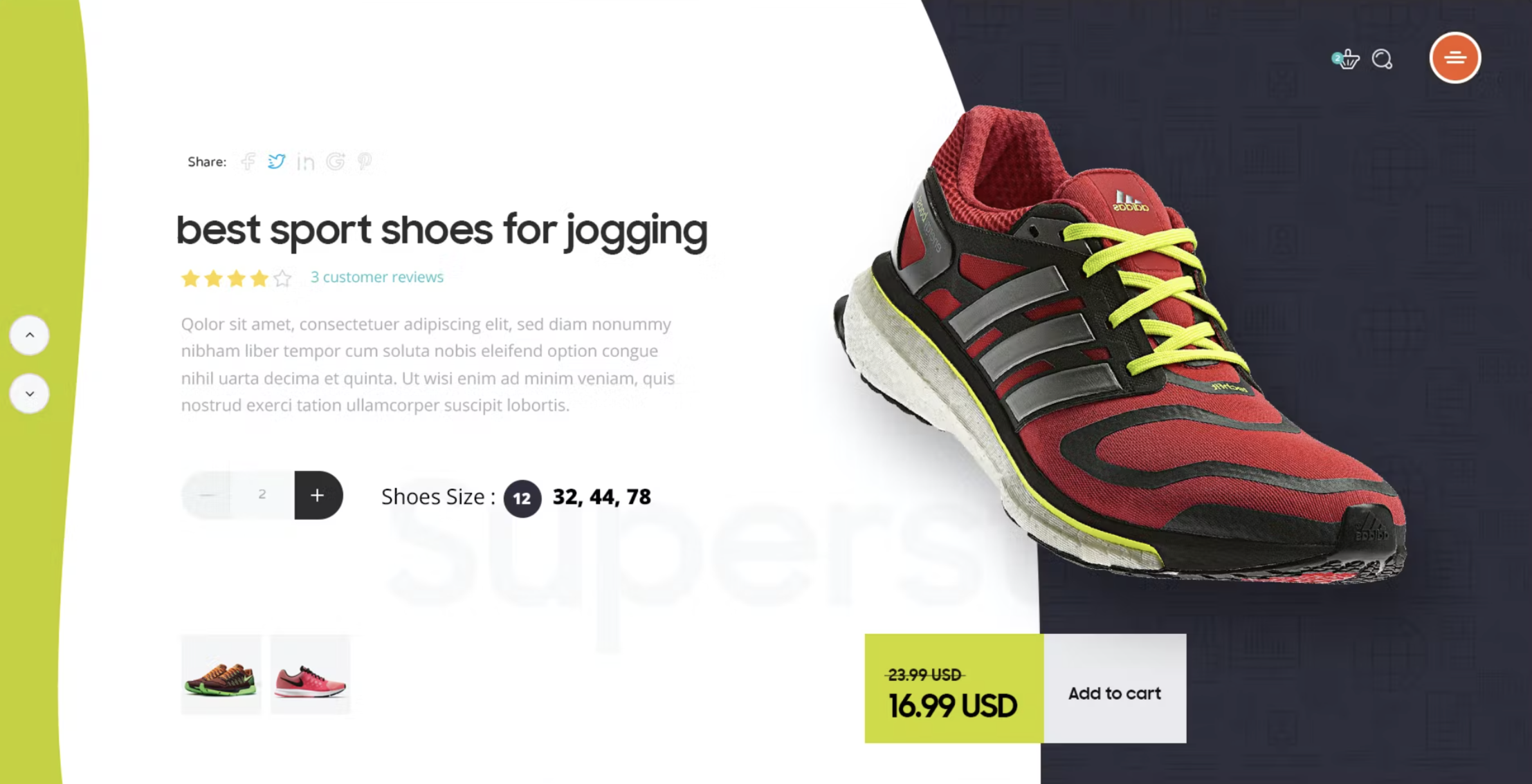
UX Product Images Gallery

Not all photo/image galleries are the same. A quick scan of the web revealed there isn’t much recent info for product image galleries. Below are some of the best practices to follow.
When buying purchasing an item at a physical store, we can ‘touch and feel’ the product that helps instill confidence in our purchase decision. However, shopping online loses this part of the experience. The price point or size of the product may dictate how many images to use. For example, larger items such as houses and cars have more images in their galleries. Many product galleries are now include video, which helps give the user a better look/understanding of the item.
Usage
Consider using a product image gallery when you want the user to browse a set of images to showcase your product.
Anatomy of a Product Image Gallery
Poorly implemented galleries can result in having no effect or potentially a negative effect. To ensure your image gallery doesn’t cause friction, make sure to include the following:
1. Roll over zoom on current image
Amazon — Product Image Gallery
Products with a lot of detail may benefit by allowing the user to have a closer look with zoom. This detailed view may help the user make their decision.
Tip: Keep the zoom view beside the original view to give the user context of where they are looking.
2. Navigation
Give users a way to move between images in the gallery and know their place in the gallery. These also keep the user in the ‘flow’
Trulia — Image Gallery
- Previous and Next buttons — allow the user to navigate between images with previous and next buttons. Note, disable the buttons if they are not usable. Ex. for the first image, ‘previous’ and for the last image, ‘next.’
- Thumbnails — a list of all images in the gallery arranged in a horizontal or vertical grid. Current image being viewed should be highlighted in the thumbnail list. Thumbnails allow the user to navigate the gallery quickly. Also, by giving a ‘sneak peek’ of what’s coming up it keeps the user in the gallery.
- Number Images/Image Count — show the user the current image number and the total number of images in the gallery. Numbering communicates to the user to their location in the gallery and how much further they have left to go.
3. Manually advance
Don’t autoplay the gallery.
http://shouldiuseacarousel.com/
WGAC 2.0 2.2.2: Pause, Stop Hide
4. Full screen
Product galleries can be on the page, however users may want to see images in greater detail. Allow for a full screen option. This reduces the visual noise and allows the user to focus on a single image.
5. Escape Hatch
Give users a way to escape in full screen mode by giving them a way to close the gallery. This can be achieved in the following ways:
- Cancel button
- Close button
- Escape key
- Click outside the window
Accessibility Tip: each gallery must have a keyboard accessible control to close that window. Ex. escape key should close the window.
Image Galleries in Mobile
A few additional touches need to be considered for image galleries in mobile.
1. Hint for next image
By showing a ‘hint’ for the next image, indicates to the user that there is more to be seen if the scroll. If this is hint is missing, users may not realize that there is a gallery that they can view. The hint can be achieved in several design techniques such as:
- edge of the next image peaking out
- ‘previous’ and ‘next’ icons
- gallery icon on the image
- total image count on the image
- and many more….
2. Full Screen
Users have access to pinch and zoom on images in mobile (if that function has not been disabled). But gallery view with a lightbox (or darken background) allows the user to focus on the single image without any other distractions. Additionally, image specific actions can be accessed here. Ex. Save Image
3. Swipe for next image
Thumb Zone — Smashing Magazine
Users have access to swipe on mobile. Swipe may reduce friction of viewing a gallery since it’s such a natural action. But remember to take into consideration the ‘thumb zone,’ and place the gallery on the page in an area where it’s natural for your users to accomplish this task.
Accessibility
W3C places images into three categories: informative, decorative and functional. It recommends that ‘alt’ text for all these types.
To learn more visit W3C tutorials on images.